Klaviyo Ascent Design System: Phone input
Creating 'just' another phone number input for Klaviyo's Ascent Design System subscribers.
The Challenge
What could be more simple than creating a Phone Number component? Constructing a simple yet powerful component that was ready for the future of the Klaviyo app, and work well for the marketing team.
The challenge here was to consider all of the possible ways to layout an input, in the context of others, that gave the user affordances to choose their country, and handling validation for such a renown complex component.
Through discussions with the stakeholders I was able to acquire some insight into previously used solutions by the marketing team, where they wanted to go, and pulled that all into my research document. There were a few stand out features that came became primary priorities:
- Representing different countries, with a default based on the app's locale
- Phone number formatting of the input mask and placeholder based on the country
- Consistent look and feel with the rest of the Klaviyo app
Getting these primary considerations together, and in alignment with stakeholders, meant the product and marketing teams would be able to use this single component for their use cases.
Discovery and Collaboration
This particular journey begins with an extensive list of prioritized components and the organizations larger initiative to enter the international space. We had an existing component that was similar, the Number Input, however the variations for this input were growing on it's own without putting in logic for phone numbers.
In talking to a few different team leaders I created a list of stakeholders who had a vested interest in the results. These stakeholders included Directors of Product Design, and Engineering Managers on both the app team, and marketing team. I also consulted with other Lead Product Designers who had related expertise. I scheduled interviews with these individuals to inform them on my process, gather any requirements or requests to create user stories, and let them know how I would be communicating progress through Jira.
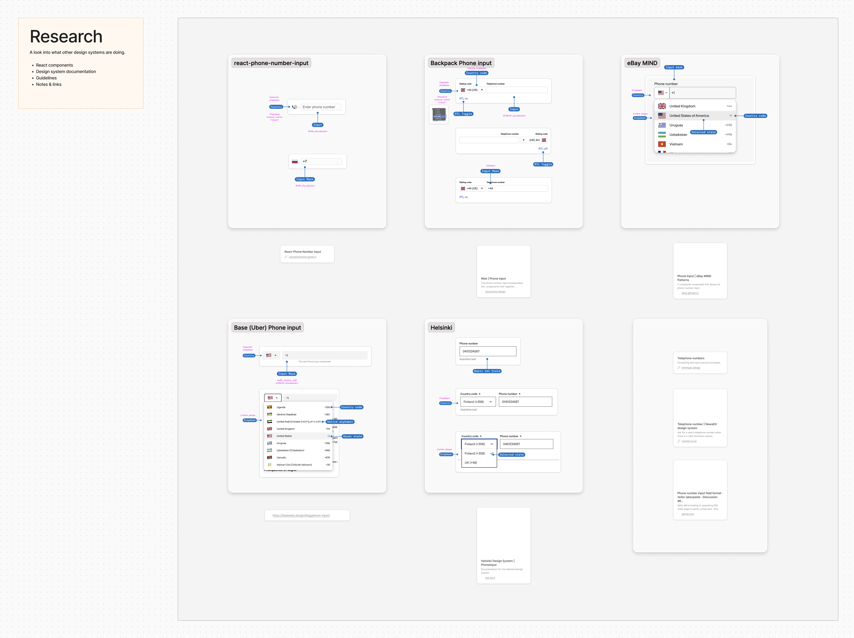
While waiting for those meetings, I starting a FigJam pulling in existing references from our Number Input and commenting on similarities and differences. I then performed cursory research into what other design systems were doing for a Phone Number input, also searching a few design system communities. I laughed — I had personal experience designing and developing the Roll by ADP Phone Number React input, and saw the same complex logic discussions and trade offs in older online community threads. Specifically, I remember dealing with the definitive phone number formatting and parsing library, developed by Google. It's JavaScript port is 8MB which drastically affects web app performance.

Ideation and Design
Taking a step back to look at all of the data and information collected from stakeholders, existing component methodology, and research guidelines and UX from other design systems I'm armed with everything I need to make decisions about how this component will look and feel. This is where the whiteboard or sketchpad comes in handy. I'll take themes that start to develop and sketch them out.
At the same time, I am writing a template we created for the design system team to organize our documentation of the component. This includes:
-
Best practices
- What to use
- When not to use
- Related components
- Internal components (that will be used in this component)
- Rules
-
Behaviors
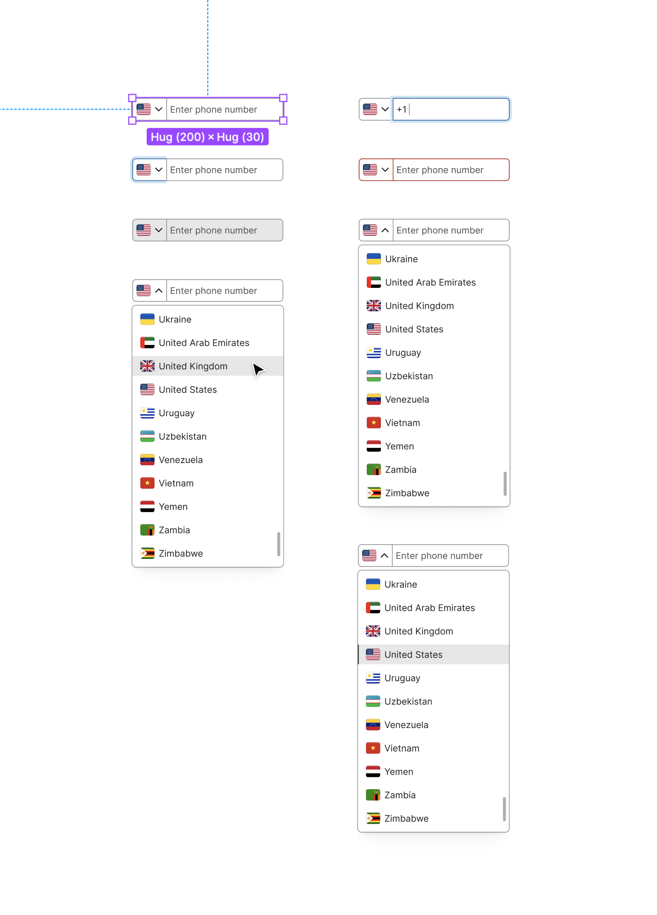
- States: Describing each state the component can be in, and the expectations
- Interactions: Describing the mouse, keyboard, and screen reader expectations
-
Content
- Working with the Content design team to align with best practices, and set expectations
During our regular stand ups with the team, we critique everyones work. This is where I bring up to the team my progress, and discuss best practice decisions. After those critiques, I will update the stakeholders to ensure they are on board, with the right level of detail. For instance, a Product Owners may only need a written bulleted list of what's been done, and whether we're on track. Product Designers and Engineers who are subscribers to the design system, and have a vested interest in the component may get that same list with visuals, or links directly to Figma for them to provide feedback.
Let's take a moment to talk about critiques. I have successfully used a few techniques throughout my career that were embedded since design school around critiques. No matter what your title is, I always keep the conversation related to the ideas and decisions that brought us to those ideas. Doing this keeps us on track with the objectives shaped from the start, and dissolves any potential emotional consequences. It's never about who is doing the work, it's about the work and whether that meets the needs of our users and the business.

Refinement & Results
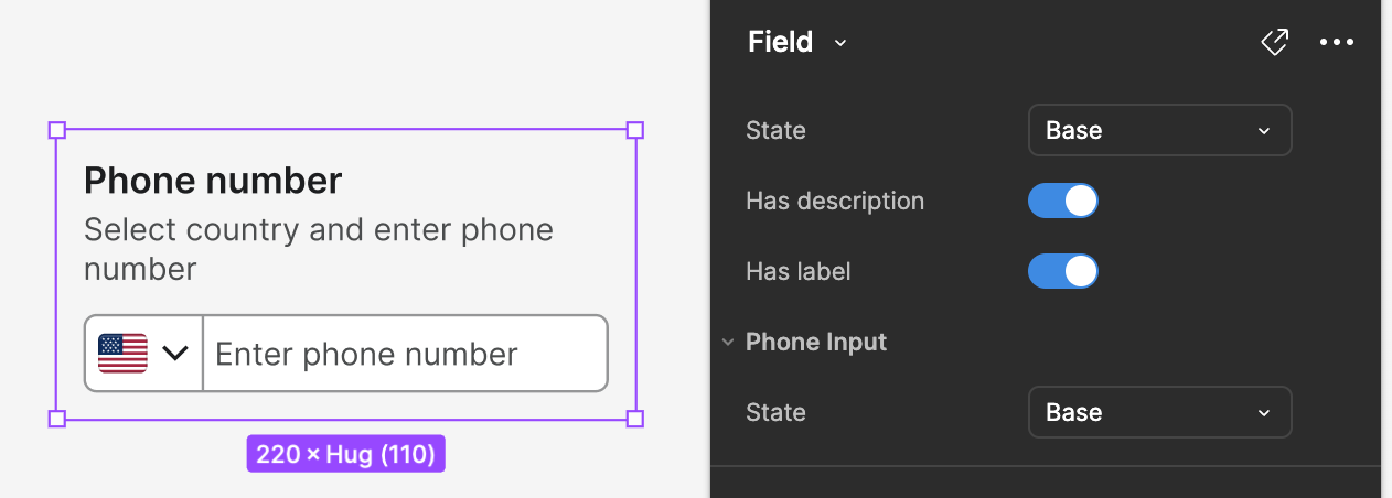
Since Figma is the tool of choice these days, it's worth noting that I will start designing without aligning Figma Styles or Variants for speed, and to explore any newer innovation a component may need. During the refinement stages, I start to align closer to existing component design principals that have been set by the team. In this particular case, the Phone input is similar to the Text input, a form component. That means sitting it in a Field component to see how it works with other inputs, labels, descriptions, and error messages. I'll also start applying any relevant Styles and replacing any parts with existing internal components that are already solving that problem.

Coming back to the documentation for the component, this is where I add:
- Visual representations of what to do, and what not to do for the Rules
- Variants: Relevant states and how they look compared to base, and any relevant data
- Anatomy: One of the visuals we use on the documentation site, and in the Figma component itself is a section with redlines to clearly articulate naming. This helps for describing and talking about the decisions made about each of these parts that make the whole
Finally we clean up the Figma file ensuring actual components are in the right page, and that there is a documentation page with examples of all the relevant states and considerations.
The results are a well thought out component with all the design, development, content, and accessibility considerations that make our teams more efficient and effective at their job. We'll ensure we've updated the Figma library changelog accordingly, and broadcast to all stakeholders via email newsletters, Slack groups, DM's and relevant calls.
React component
What does this look like as a React component? Functionally, we have
this PhoneInput working correctly
with some caveats. The world is imperfect. When thinking about that
conversation between design and development, compromises need to occur.
Input masking is a good example. The design called for the country
code to be in place. Doing so is more of a challenge. Another user
experience consideration is what happens to numbers already input,
after the CountrySelector component
is updated? Currently, we clear the field. Is that the best UX?
Other trade offs are with the dependencies we use. Do we build the
input mask and formatter by hand? I've decided to use a dependency for
input masking, formatting, and the custom select menu. These
dependencies come with their own problems. For instance, the radix dependency has an SVG icon when toggling on position="popper. This icon has no class, or data attribute, or option to toggle off.
Therefore, I have kept Radix's native MacOS menu style for the portal.
As a prototype of this being built in React, I'm pleased. We have all the elements and everything is accessible for keyboard users. For production, I would go deeper into the pros and cons of using these depenedencies, look for more options, and read into what other community members have done in the past.
Contact
Availability, partnerships, and questions.
Want to work together?
I am working with a limited availability for consulting. Learn more about how I can sharpen your SaaS brand and product.

Reach out
Have a question or comment? Feel free to drop me a line below!