In business, accessibility on the web and for digital devices, is a topic rife with ignorance. From organizational culture, to product owners, to designers and developers, we’re all responsible. It’s also a fundamental civil right in many countries . Today we’re going to take a peak at the four principals the WCAG consider guidelines and success criteria.
On the surface, you’d be forgiven for not putting effort into accessible considerations if you’ve been working in the field for years and haven’t had a single OKR, KPO or task related to the topic. However, if you are building a digital product or service in 2023 and beyond, you should be considering all your users.
What are some traits linked to disabilities?
- Physical like vision loss, hearing loss, or mobility issues
- Neurodivergent like attention deficit disorder, dyslexia or autism
The way I have broached the topic to executives is by saying, “You wouldn’t stop a patron from coming to your physical store, to purchase your products or services, because they were in a wheelchair.” On the contrary you would install wheelchair ramps, powered doors and other accessibility considerations to make their access easy.
The topic of accessibility is a deep one, with a wealth of knowledge available. We’ll scratch the surface today with Web Content Accessibility Guidelines (WCAG) which are international standard guidelines. First introduced in 1999, the latest stable document is version 2.1 . Today, we’re specifically going to look at the 4 principals the WCAG consider guidelines and success criteria, and I’ll use examples to thread everything together.
Aside, there is a whole Accessibility Fundamentals Overview I recommended consuming for further high level information.
1 Perceivable
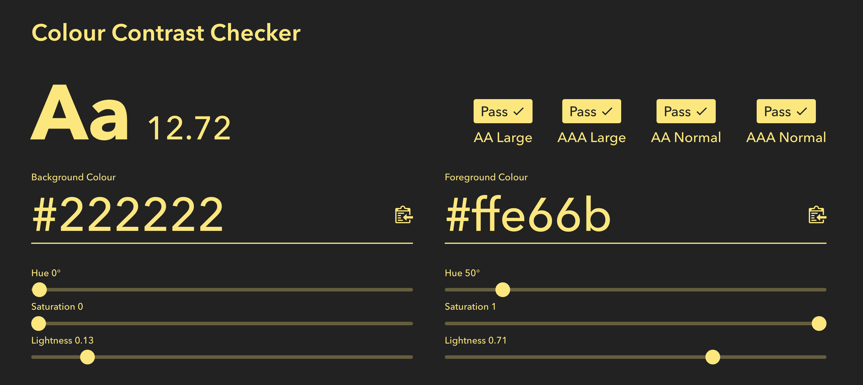
Information and user interface components that must be presentable in ways users can perceive . If you have imagery that has useful information a user needs in your application, a text alternative for screen readers is crucial, or else that information is lost. Another example is having color contrasts for text and backgrounds that meets AA or AAA contrast ratios for low vision users.

2 Operable
User interface components and navigation must be operable. I have worked on more than a few React apps that have had zero keyboard affordances for screen readers to interact with navigations, accordions for progressive disclosure, or a simple button. Using aria attributes and semantic HTML can solve these problems.
3 Understandable
Information and the operation of the user interface must be understandable . I am reminded an app I am using daily that has important navigation items as icons with no supplemental information saying what it does. As a fully sighted user I have no idea what it does until I click on them. I am supposed to ‘know’ what the icons mean visually. For low or no vision users, the buttons are simply inaccessible.
4 Robust
Content must be robust enough that it can be interpreted reliably by a wide variety of user agents, including assistive technologies . To clarify a bit more “user agent” is a request header that your browser (or other device) sends and lets the server identify information about your device.
Using web standard markup correctly, and sometimes adding specific attributes placed on that markup is the primary solution. Using the icon examples above, adding title tags to graphical elements and a role attribute helps devices know, and deliver that information to all users.
That’s already a lot of information, and I don’t even know if I’d call this scratching the surface! What else would you like to know about digital accessibility? Feel free to reach out to me and let me know!
Want to dive a deeper? Giving a Damn About Accessibility by Sheri Byrne-Haber, CPACC is a fantastic read. I’ll share more resources on Twitter and LinkedIn as well.
Helpful?
